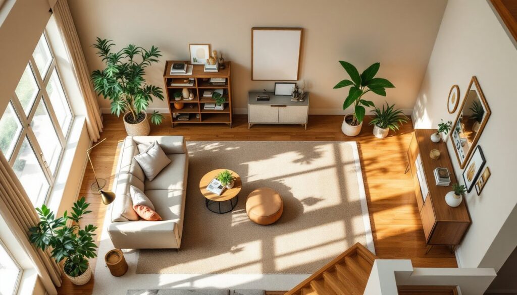
Small living rooms can feel cramped, but paint is one of the cheapest and most effective ways to completely transform the space. The right color choice makes walls seem further apart, bounces natural light around the room, and sets the mood for the entire home. Whether you’re working with a 200-square-foot apartment or a modest suburban living room, these seven paint ideas will help you maximize light, visual space, and style without major renovation costs. Paint typically costs $25–$50 per gallon and covers about 350–400 square feet, making it an incredibly affordable starting point for any room refresh.
Table of Contents
ToggleKey Takeaways
- Light colors and neutral tones create optical illusions that make small living rooms appear larger and brighter by reflecting natural light around the space.
- An accent wall painted in bold jewel tones like navy, forest green, or terracotta adds personality without overwhelming a compact room when paired with light-colored side walls.
- Small living room paint ideas benefit from monochromatic color schemes that vary tints and shades of a single color family, creating visual flow and sophistication.
- Satin finish paint is ideal for small living rooms as it reflects light to enhance spaciousness while resisting stains better than matte finishes.
- Proper surface preparation, including priming, filling cracks, and using painter’s tape, is essential for achieving a professional-looking paint job that avoids common blotchy results.
- Paint is one of the most affordable home improvements at $25–$50 per gallon, making it a cost-effective way to transform a small space without major renovations.
Leverage Light Colors to Create Illusions of Space
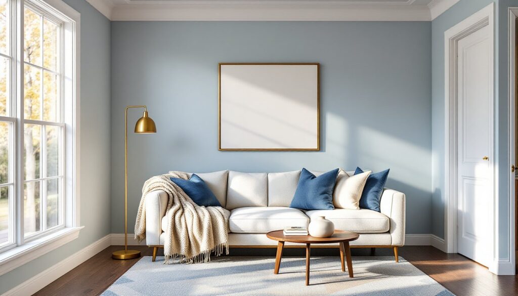
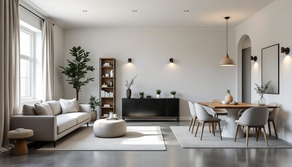
Light colors, soft whites, pale grays, and warm creams, reflect light and trick the eye into perceiving a room as larger than it actually is. This is basic optics: glossy or light-colored surfaces bounce light around, while darker shades absorb it. For a small living room, consider Benjamin Moore’s “Cloud White” or Sherwin-Williams “Alabaster” as neutral anchors that won’t feel sterile. These aren’t pure white: they have subtle warmth that keeps the room feeling welcoming rather than clinical.
When selecting a light color, grab sample cards and tape them to different walls. Watch how they shift throughout the day, morning light behaves differently than afternoon or evening light. A color that looks perfect at 2 p.m. might read too cool at 8 p.m., so observe for at least 24 hours before committing.
Light paint also pairs beautifully with sectional sofas for small living rooms and keeps the space feeling airy even when furniture is present. The walls recede, and the eye focuses on furnishings and decor rather than the room’s tight dimensions. Many designers recommend staying in the 80–90 LRV (Light Reflectance Value) range for maximum brightness without washing out color depth.
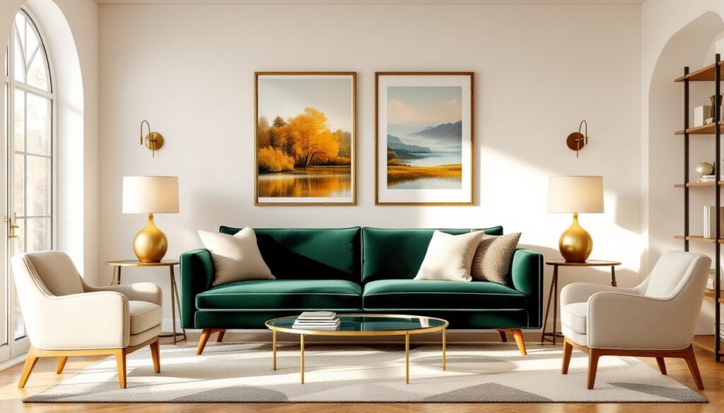
Go Bold With an Accent Wall
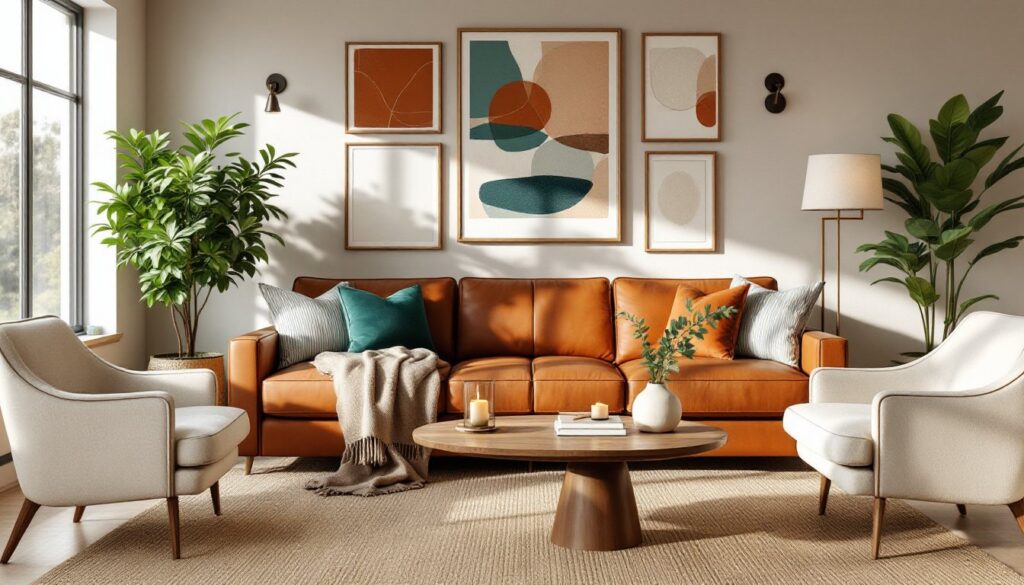
An accent wall, painting one wall a distinctly different color than the other three, adds personality without overwhelming a small space. The trick is choosing the right wall and the right color intensity. Paint the wall opposite your entry point, as it’s the first thing you’ll see and creates a visual focal point.
Deep jewel tones work surprisingly well in small rooms when applied strategically. Consider navy blue, forest green, or warm terracotta, colors that feel moody rather than claustrophobic. Pair them with light-colored side walls to maintain the sense of openness. This approach works because the eye zones in on the colored wall, and the lighter walls provide breathing room.
Resources like apartment therapy showcase how small spaces benefit from strategic color blocking. Keep trim and ceiling white or off-white to anchor the visual weight. One accent wall is usually enough: two can feel busy in a compact room. Always use the same paint quality and finish across all walls, a matte accent and satin walls will look patchy and inconsistent.
Monochromatic Schemes for Cohesion and Depth
Monochromatic doesn’t mean boring, it means varying tints and shades of a single color family. This approach creates visual flow and makes a room feel intentional and sophisticated. A monochromatic scheme might include pale gray on the walls, a darker charcoal accent wall, and soft gray-tinted trim.
This strategy works beautifully because the eye doesn’t get jarred by competing colors, so the room feels larger and more restful. Varying the saturation (how intense the color is) gives depth without visual chaos. A light gray wall feels different from a mid-tone gray wall, even though they’re technically the same color family.
When painting a monochromatic living room, choose your darkest shade first (for the accent wall or trim), then select lighter versions of that same color for main walls. Paint swatches from the same manufacturer often include five to seven shades in a single palette, making selection straightforward. This approach is especially effective in small rooms where natural light is limited, as a true monochromatic scheme won’t compete for visual attention.
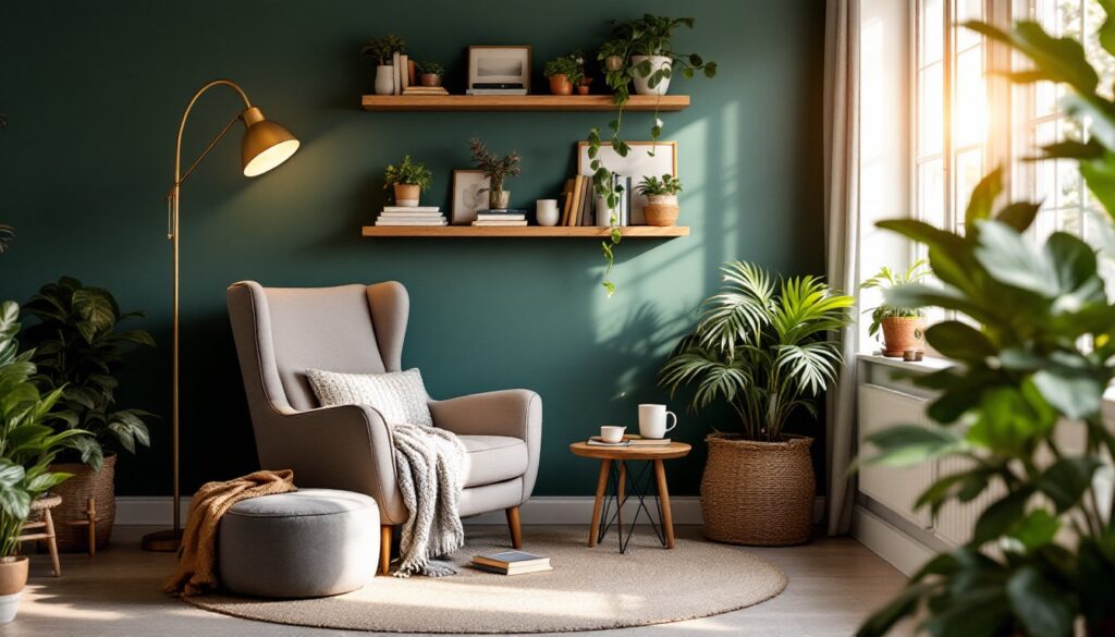
Cool Tones vs. Warm Tones: Which Works Best
Cool tones (blues, greens, purples, and grays with blue undertones) feel calm and expansive, while warm tones (reds, oranges, yellows, and grays with yellow undertones) feel cozy and intimate. In a small living room, the choice depends on your goals and natural light.
North-facing rooms that receive mostly indirect light benefit from warm tones to counteract natural coolness. South-facing rooms with plenty of warm sunlight can handle cool tones without feeling cold. Before committing, check your room’s light direction and intensity at different times of day. According to research on paint colors for small spaces, cool greens and soft blues are particularly effective at making tight spaces feel more open.
Don’t overthink this, choose a tone that complements your furniture and makes you happy. A warm, soft taupe works just as well as a cool gray if it fits your aesthetic. The real key is consistency: pair your color choice with living rooms with area rugs and textiles in complementary tones to create harmony without visual clutter.
Strategic Finish Choices: Matte, Satin, and Gloss
Paint finish, the sheen level, changes how color reads and how practical the wall is. Matte finish absorbs light, making walls feel less prominent: it’s ideal for hiding imperfections but harder to clean. Satin finish (sometimes called eggshell) offers a subtle sheen, bounces a bit of light, and resists stains better than matte, perfect for living rooms where people actually sit on the furniture.
Semi-gloss or gloss finishes are rarely used on living room walls: they’re too reflective and shiny for comfort, though some designers use semi-gloss on trim for durability and aesthetic contrast.
For small living rooms, satin is usually the sweet spot. It reflects enough light to enhance the sense of space without looking plastic or overly shiny. Matte works if you’re meticulous about keeping walls clean, but it shows fingerprints and dust more easily in high-traffic areas.
When ordering paint, always specify the finish along with the color. Two different finishes of the same color will look like two different colors on the wall, which defeats the purpose of a cohesive design. Use higher-quality paint (premium tier over budget tier) in small spaces, as better formulations cover more evenly and hide wall imperfections that become obvious when everything’s more visible.
Preparation and Application Tips for a Professional Look
Good preparation separates professional-looking paint jobs from sloppy ones. Start by clearing the room of furniture or shifting it to the center and covering with plastic. Remove outlet covers, light switch plates, and hardware (or cover them with painter’s tape). Wash walls with a damp cloth to remove dust, and sand any glossy surfaces with 120-grit sandpaper so primer and paint adhere properly.
Fill holes and cracks with spackling compound, let it dry fully, sand smooth, and prime before painting. Primer is non-negotiable if you’re covering a darker color with lighter paint or painting over glossy surfaces. Cheap primer won’t hide previous colors: invest in a quality primer to avoid needing three coats of finish paint.
Use painter’s tape along trim, ceiling, and around outlets. Press it down firmly so paint doesn’t seep underneath. Apply paint with a brush (2–3 inches wide) along edges and a roller (3/8-inch nap) for flat wall areas. Paint in overlapping W-patterns to avoid streaks, and always maintain a wet edge, don’t let paint dry before the next section overlaps it.
Two coats are standard: allow full dry time between coats (check the can: most interior paints need 4–8 hours). A small living room typically needs 1–2 gallons total. Humidity and temperature matter, paint in conditions between 50–85°F and 30–85% humidity for best results. Skip painting in extreme cold or humidity, as the paint won’t cure properly. Common mistakes like insufficient prep work, rushing between coats, or using cheap brushes (which shed bristles) result in a blotchy, unprofessional finish that looks worse than before.
For accent walls, measure carefully and snap chalk lines if you want a crisp edge. Consider budget-friendly home makeovers on addicted2decorating for additional painting technique inspiration and before-and-after galleries.
Conclusion
Small living room paint ideas boil down to strategy: light colors for space, bold accents for personality, and proper prep for polish. Whether you lean toward airy neutrals, moody monochromatic schemes, or strategic accent walls, paint is one of the highest-impact, lowest-cost improvements any homeowner can make. Match your finish to your lifestyle, prepare surfaces honestly, and apply with patience. A small room deserves thoughtful color choices, and with the right approach, paint transforms cramped spaces into visually larger, more inviting homes.